Did your last website launch look something like this: you grabbed a template, plugged in some “good enough for now” copy and hustled your way to launch day?
If so, you’ve got lots of company.
But now the dust’s long since settled on your (hopefully!) banger of a launch, and you’ve returned to the day-to-day grind of running your business, you may sense your website isn’t meeting its full potential.
Here are a couple of red flags it’s not connecting and converting as it should:
- High traffic but low conversion rates: You’re doing something right to get people to your site but losing them before they hit “buy” or “book a call.”
- High bounce rate: People are visiting one page and then immediately leaving your site when the goal is for them to stick around and browse!
If you see numbers like this on your analytics page, it’s time to audit your website content.
Don’t panic – this doesn’t involve the CRA! And you don’t need to spend hundreds or thousands of dollars hiring an agency to do your audit (despite what you may have heard).
And even if your analytics are solid (or you’re not sure how to interpret all that back-end data), every business, no matter its size, industry or sector, should do a website copy/content at least yearly, ideally every six months or even quarterly. But it will be a tedious and pointless task if you don’t know what to look for as you comb through your site.
A quick side note: this article focuses on auditing copy for a better customer experience, not from an SEO perspective. If you’re interested in learning more about SEO, may I recommend this article by Hubspot?

Keep the Goods Above the Fold
Step one of any website audit is to check your analytics to understand how people use your site. Those two bullets I mentioned above are a great starting place.
The second step is to go to your homepage and see what is currently above the fold.
The term “above the fold” comes from the good old days of newspapers. It refers to the top half of the paper’s front page, where the most important news stories get top billing, with attention-grabbing photos and big headlines.
And guess what? It means the same thing in the web design world. “Above the fold” means everything the reader sees before they scroll. What you put above the fold on any page is important, but most crucial of all is your homepage.
Your homepage should have the following elements above the fold:
- A strong headline
- Punchy, informative body text explaining how your product or service can help solve your customer’s problem
- A strong call to action (learn more, shop now, etc.)
Let’s look at this gorgeous, perfect example from the clothing company Everlane, shall we?
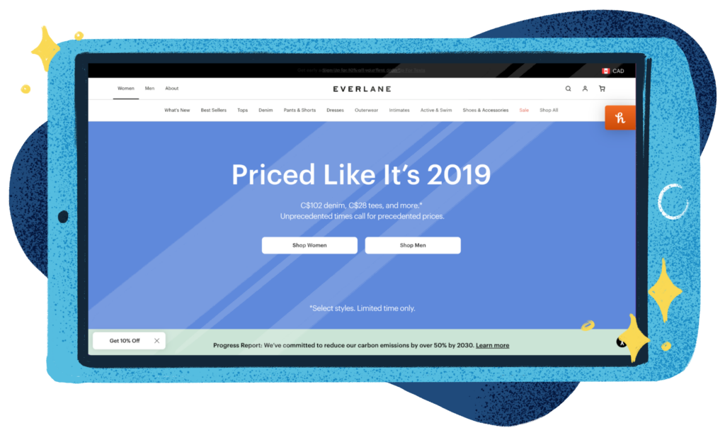
First off, let’s give a huge round of applause to whoever did this. Well done, bravo, encore!
You don’t often see a clothing company rely solely on copy to catch your eye. Usually, they have fashionable clothes and beautiful models to keep us engaged and scrolling. The fine folks at Everlane made a ballsy move here, but with a headline like this, who needs gorgeous models?
Right off the bat, “Priced Like It’s 2019” catches my attention, makes me laugh, makes me nostalgic for simpler times, and makes me want to read more.
Their body text doesn’t beat around the bush. Right away, it gives us pricing, then they finish it off with a relatable, current line, “Unprecedented times call for precedented prices.” They’re giving me a deal and a punchline about the economy and state of the world?! Win, win.
Next, we see a plain-as-day call-to-action: do you want to see the women’s or the men’s clothes?
Then in that final sliver of the “above the fold” area, Everlane smacks us with the fact that they’re working to reduce their carbon emissions by over 50% by 2030.
They have told me, the customer, everything I should know about them right off the top. They are a company with a conscience and are solving my problem of having only jeans with holes in them that don’t really fit anymore after three years of living in a pandemic, a dwindling account balance thanks to the rising costs of food and gas, and they are working on shrinking their carbon footprint so I can sleep well at night knowing I’ve shopped responsibly.
Then, the second I scroll below the fold, they hit me with their beautiful models and chic clothes for fall that makes me drool and scavenge for my credit card.
Take a look at your homepage or some of your key landing pages. Does your copy have the same effect? Does it tell people exactly what to expect from your business? If the answer is no, keep reading!
The Rule Of One.
If that Everlane example has you panicking over how to make your copy that concise, simple and effective – fret not, friend!
One of the foundational rules of copywriting that can help you rein in your words and focus your message is The Rule Of One. This means that every piece of content you write (and I mean every piece) should have one big idea, one reader, one promise, and one call to action.
To do this, you will, of course, need to know exactly who you’re talking to (aka, you have to know exactly who your customer is and exactly how they think.) I urge you not to take a stab-in-the-dark approach to this, or worse, make a random decision based on who you want your customer to be. Instead, check out my post on How To Write To Your Audience for ways to find out who your customers actually are and why they came to you (and hopefully keep coming back!)
It is so tempting to want to appeal to the entire general public, but the more specific you can be, the better the odds you’ll hit your ideal customer base.
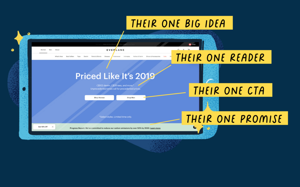
To harken back to the Everlane homepage, we can see exactly how they use the rule of one in their copy:
Their one big idea:
Not giving into inflated 2022 prices.
Their one reader:
Young, informed professionals who want to shop ethically but don’t have oodles of cash lying around.
Their one promise:
Reduce carbon emissions by over 50% by 2030
Their one call to action:
Shop now
Content Inventory.
If your website is content-heavy (meaning you are consistently putting out new blog articles), it’s time to take stock. Blogs are like pantries: stale old stuff accumulates over the years.
Do you have a great piece you wrote in April 2020 that mentions the shiny new pandemic that now, in 2022, makes it feel irrelevant, despite having important information you still want to share? Update it by cutting the fat and leaving all the good meaty bits.
And be sure to add an updated date so people don’t assume it’s outdated and old.
And then work your way to the next one.
OK, that’s all you need to get started now on your very own website copy audit. Didn’t I tell you it would be simple?
Take a look at your website and take stock of what you’ve got. Is it in need of a little refresh? How is it looking above the fold?

